Lab:
The Lab is a source of information for Artists and Art Lovers alike. You can find useful information to help develop your career as an artist such as tutorials, interviews, news, and a lot more!

Tutorial by Esther Morales, graphic designer.
Even though I'm fascinated by creating characters from scratch, conceiving and giving life to illustrations taken directly from my imagination, my head is also populated by fanarts. Video games, series, books, movies... There are a thousand worlds that call my attention, whose environment and history inspire me and that I would love to draw in my own style as a small homage to those thinking minds and hands, creators of marvellous graphics.
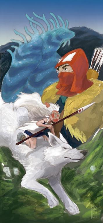
The Princess Mononoke was one of those movies that marked a before and an after in my life. Those whose sublime nature of their country sides you enjoy, whose soundtrack puts your hairs on end and who want to take you from the sofa to San's battle to save the woods; you know what I'm talking about.
In this guide, I'll show you the process of my illustration in honour of the feature film by the master Hayao Miyazaki. It's taken more than 20 hours from the basic ideas until the end result, but thanks to The Art Boulevard, you can go from one step to another in a few minutes. I hope you find it interesting!
Step 1: the idea.
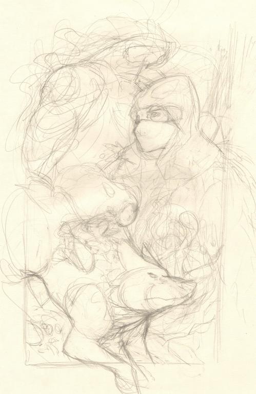
As in all creative processes, the first step is to come up with an idea. What do I want to appear in my illustration? What are the characters going to be doing? What will be the composition of the image?
In my case, I wanted a dynamic composition, one that reflected all the action that happens in the movie and where the two main characters, San and Ashitaka, appear. The figures are available in a circular manner, in such a way that the spectator passes from one place to another in the illustration, guided by the movement of the characters.
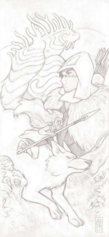
Step 2: the line.
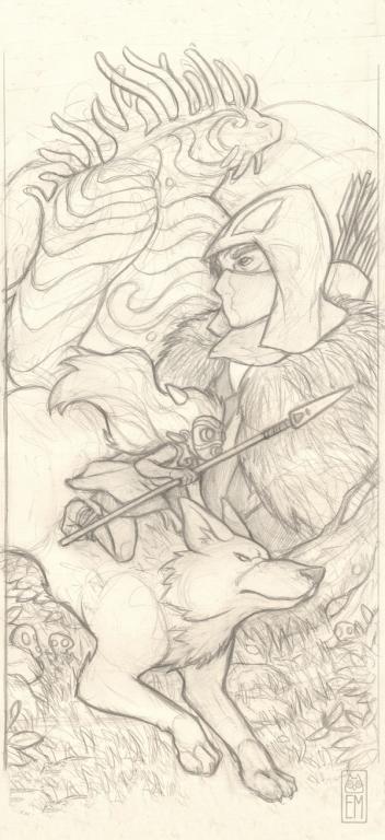
My work process is, always, to being with a pen and paper to create the sketch and the line but, as they say, "everyone has their own specialty", and there are artists that work in completely different ways. To create the line, I normally already have the image's details and the attitude of the characters clear, so that drawing is something solid, even though some element can be changed when it's time to introduce the colour. Once I'm happy with the drawing, I scan it and begin with the colour digitally, sometimes, as in this case, I erase a few of the imperfections and further define the key lines, cleaning the drawing, other times, I prefer to maintain the noise of the traces and the grain of the paper.
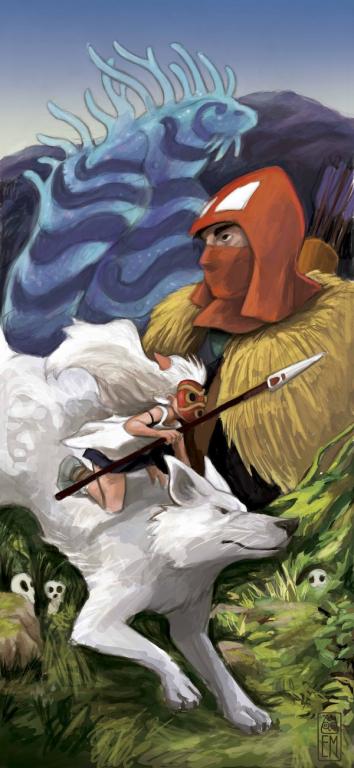
Step 3: colour stains.
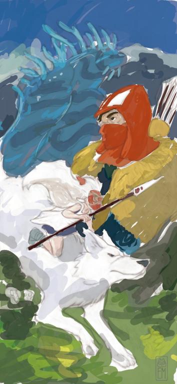
Beginning the colour is always a step that for me is very complicated, I spend time in deciding which tones to use and which will be the best to create the atmosphere that I'm looking for in an illustration. Here you can see that I have added a base of general colours, to create a general atmospheric idea of the daytime light of the scene.
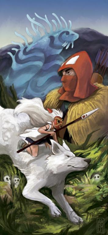
Step 4: beginning with the contrast.
The next step of the illustration is to begin to introduce lights and shadows, generating volume in the figures and their surroundings. You can also enrich the image with more tones within the same chromatic range; within a green you can take out hundreds of tones so that if you're not happy with the first that comes to us, we can play with the colour palette.
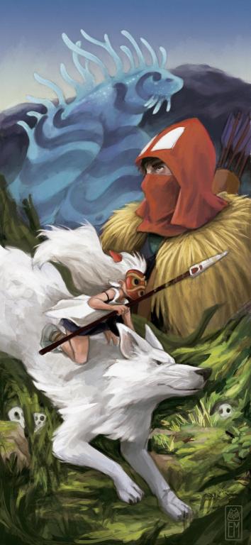
Step 5: depth and levels.
At this point in the process I had the feeling that three levels (San, Ashitaka and the Nightwalker) had no relation between them nor did it generate a sensation of spaciousness. Even if the illustration isn't realistic on distant levels (they generate a presentation of the characters like in the movie poster) I wanted there to be a space between the levels and I did not know how to achieve it.
Finally, I decided to add a tree trunk behind San, which in addition to bringing her to the first level, stresses the direction of the wolf's lunge. And a mist around the Nightwalker, bringing it from the depths of the last levels and giving it the figure's characteristic translucence.
Step 6: details, details and more details
Finally, it all comes down to adding details and perfecting the drawing, until reaching the point where we are satisfied, or almost satisfied, with the illustration. In this step, everything depends on the style that we want to add to our drawing, it can be left a little loose giving freshness to the image, or we can continue working on it if we want a more realistic or defined treatment. In this case, I was looking for a quite finished final result, so I continued cleaning the details until I was happy with the result.
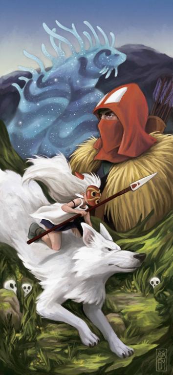
And this is the final result of the whole process. After the pen line, the illustration’s colours are entirely done with the round pencil by Adobe Photoshop, playing with its opacity and the pad. When I've finished an image I normally test the saturation and the contrast of the colours and I add a small amount of noise (in filter>add noise) so that the result does not seem too digital.
Thank you for your time and I hope that you have enjoyed this tutorial!
Portfolio: www.esthermorales.carbonmade.com
Official Facebook page: www.facebook.com/EstherMoralesIllustration